Nothing about your phone habit is accidental. The pull you feel is the output of a well-understood body of design practice, refined over fifteen years by teams whose revenue depends directly on how long you stay. Knowing the mechanics does not immunise you — knowing how a slot machine works does not make it boring — but it does something more useful: it moves the problem out of your character and into the interface, where it can actually be dealt with.

1. Infinite scroll
The single most consequential interface decision of the last two decades. A traditional page of results ends, and an ending creates a decision point: continue, or stop. Infinite scroll deletes that decision point entirely by loading the next batch before you reach the bottom.
Humans are excellent at stopping at boundaries and terrible at stopping in the middle of something. Remove the boundary and the session ends when you are interrupted or too tired to continue — not when you have had enough.
Disarm it: decide the stopping condition before you start (“until the bus arrives”), or use a blocker with a time window, because the app will never offer you one.
2. Variable rewards
The most powerful mechanism on the list, borrowed directly from gambling research. A reward delivered every time becomes boring. A reward delivered unpredictably produces far more persistent behaviour.
Pull to refresh is a lever. Most pulls give you nothing. Occasionally one gives you something good. That uncertainty is precisely what makes it compulsive — you are not checking because you expect something, you are checking because you might get something, and your brain treats the possibility as the reward. More on the neuroscience in dopamine and social media.
Disarm it: turn off badges, so there is no counter suggesting something might be waiting.
3. Autoplay
Every video has one natural ending. Autoplay removes it and substitutes a five-second countdown, which converts an active decision (“do I want another?”) into a passive one (“do I want to stop this?”). Those are not the same question, and people answer them very differently.
Disarm it: turn autoplay off in YouTube, Netflix, Instagram, and TikTok’s data-saver settings. It is one toggle each and it is the highest-value ten minutes in this article. See how to stop watching so much YouTube.
4. Manufactured urgency
Stories that expire in 24 hours. Limited drops. “Active now” dots. None of this content is genuinely time-critical — the expiry is added specifically to create a deadline where none existed.
Deadlines are extremely effective at getting people to open apps, and an artificial one costs the platform nothing.
Disarm it: notice that you have never once regretted missing a story.
5. Streaks and loss aversion
We feel a loss roughly twice as strongly as an equivalent gain. A streak turns that into a retention mechanic: after 200 days, you are no longer opening the app for value, you are opening it to avoid losing a number.
Streaks are not inherently manipulative — the test is what the streak counts. A streak that rewards practising a language or checking in on your own habit uses loss aversion in your favour, and breaking it costs you nothing real. A streak that requires daily messaging to maintain a friendship has converted a relationship into an obligation. Ask whose goal the number serves. There is a fuller treatment in why streaks build habits.
6. Social obligation
Read receipts, typing indicators, “seen at 22:41”, online-now dots. Each one manufactures a duty that did not previously exist. Before read receipts, not replying immediately was normal. After them, it is a visible choice that the other person can see you making.
This is why messaging apps are the hardest category to cut. It is not entertainment you are giving up — it is the appearance of being a considerate person.
Disarm it: turn off read receipts and last-seen where the platform allows it. The social cost is far lower than it feels.
7. Notifications engineered to look personal
Compare “3 new posts in your feed” with “Ayşe and 4 others liked your photo”. The second is written to look like a person doing something specific about you. Very often it is a batched, delayed, algorithmically-timed prompt, sent when the system predicts you are most likely to return.
Disarm it: allow notifications only from people, never from platforms. Ten minutes in Settings, and it removes most of the inbound pull. See notification overload.
8. Friction asymmetry
Notice how easy it is to start and how slightly-harder it is to stop. Signing up takes one tap; deleting an account is buried three menus deep on a web page. The feed loads instantly; the settings screen for controlling it is nested. Nothing here is illegal or even hidden. It is just that every path toward more use is smooth and every path toward less use has a small amount of sand in it.
Disarm it: deliberately invert the asymmetry on your own device. Log out after every session. Move the icon off the home screen. Add your own sand. This is what the 20-second rule does.
The summary table
| Mechanic | What it removes or adds | Your counter-move |
|---|---|---|
| Infinite scroll | Removes the stopping point | Decide the end before you start |
| Variable rewards | Adds unpredictability | Badges off |
| Autoplay | Removes the decision | Autoplay off |
| Expiring content | Adds a false deadline | Notice you never miss anything |
| Streaks | Adds a loss to avoid | Ask what the streak counts |
| Read receipts | Adds an obligation | Turn them off |
| Personal-looking alerts | Adds false urgency | People only, no platforms |
| Friction asymmetry | Makes leaving harder | Add your own friction |
Is this a conspiracy?
No, and framing it that way makes it harder to deal with. Nobody sat in a room deciding to harm you. What happened is more ordinary and more difficult to fix: a business model in which revenue is proportional to attention, combined with the ability to test thousands of variations against millions of people.
In that environment, the design that keeps people scrolling wins on the metrics, every time, without anyone needing bad intent. Several of the people who built these patterns have since said publicly that they regret them. The patterns remain, because the incentive that produced them has not changed.
“I spent four years optimising a feed for time-in-app. We were not villains, we were just measured on one number. Every single test that increased that number shipped. I only really understood what we had built when I tried to stop using our own product.” — a former product manager at a social platform
The practical implication: this is not a fair fight and you should stop expecting yourself to win it with willpower. You are one person with finite attention against a system that has run more experiments on human behaviour than any psychology department in history. Change the interface, not your resolve.
How does Unscrol help?
Every counter-move in the table above is free and takes about twenty minutes total. Autoplay off, badges off, notifications from people only, icons off the home screen. Do those first — they neutralise most of the mechanics on this list without any app at all.
Unscrol addresses the last row: friction asymmetry. It is an iPhone and Apple Watch app built on Apple’s Screen Time frameworks, so blocks are enforced by iOS rather than by an overlay a determined thumb can dismiss.
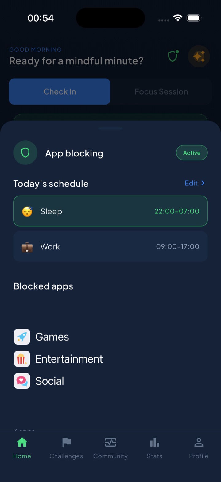
Scheduled blocks put chosen categories behind a shield during windows you set in advance, which is the direct inversion of the pattern: the path toward less use becomes the smooth one, and the path toward more use is the one with sand in it. A short deliberate take-a-break bypass covers genuine exceptions without becoming a one-tap escape. The guess-versus-real check exists because the mechanics above work best when unmeasured, and the gap between your estimate and the real number is usually the most persuasive thing on your screen. A unified daily streak grows on any day you do a quick check-in or complete one of 45+ challenges — a streak that counts your behaviour rather than your app usage, which is the distinction section five was about. Block lists and usage data are processed on-device by iOS and never reach Unscrol’s servers. Free to download; the optional Pro tier adds a Streak Saver that rescues a single missed day, twice a week.
Frequently asked questions
How are apps designed to be addictive?
Through a small set of well-documented design patterns rather than any single trick. The main ones are infinite scroll, which removes the natural stopping point; variable rewards, which make each refresh unpredictable and therefore compelling; autoplay, which replaces a decision with a countdown; artificial urgency through expiring content and streaks; social obligation through read receipts and typing indicators; notifications engineered to look personal; and interfaces that make leaving slightly harder than staying. None of these are accidents. They are standard practice in products whose revenue depends on time spent.
What is infinite scroll and why does it work?
Infinite scroll loads new content automatically as you reach the bottom, so a feed never ends. It works because human beings are very good at stopping at natural boundaries and very bad at stopping in the middle of something. A page of ten results creates a decision point at the bottom; an endless feed never presents one, so the session ends only when you are interrupted or exhausted. The designer who invented it has publicly described regretting it, and the pattern is now standard on almost every major platform.
Are streaks a dark pattern?
It depends entirely on what the streak is counting. A streak that rewards a behaviour genuinely good for you — practising a language, exercising, checking in on your own habits — uses loss aversion in your favour, and losing it costs you nothing real. A streak that requires daily app usage to maintain a social relationship converts a friendship into an obligation and punishes you for taking a day off. The test is simple: ask whether the streak serves your goal or the platform's engagement metric, and what you actually lose when it breaks.