Put the number where you already look, instead of going to find it. Checking your screen time inside an app costs you a pickup, an unlock, and a walk past your own home screen — the exact sequence you are trying to have less of. A lock screen widget answers the question in the glance before the unlock. A home screen widget cannot stop a pickup, since you have already picked the phone up to see it, but it can occupy the slot where the tempting app used to be. Get the placement right and the useful number is the first thing your eye lands on.

Why does opening an app to check your screen time backfire?
Because the check is itself a session. Most phone use does not start with a decision to browse; it starts with a two-second question, and self-monitoring turns out to be one of those questions.
Trace what happens when you want to know how you are doing. You wake the phone, unlock it, and cross the home screen where every icon you are trying to avoid sits in its usual place, lit and badged. You open Settings, tap Screen Time, scroll, read a chart, then come back out through the same home screen. That is five or six exposures to the thing you were measuring, generated by the act of measuring it. Same irony as the habit tracker guide: logging “I used my phone less” on the phone puts you back on the phone.
A widget removes the sequence. The number is rendered before you touch anything, under the clock on a screen you already see dozens of times a day.
What belongs on a lock screen, and what belongs on a home screen?
Different jobs, and the common mistake is putting the same widget on both.
The lock screen is the only surface that reaches you before the pickup completes. It is small, monochrome and non-interactive by nature, which is a feature: it forces the information down to one value you can read in under a second.
The home screen is after. By the time you see it, the unlock has happened. Its job is not prevention but placement — being bigger and better positioned than the app you are avoiding.
| Lock screen widget | Home screen widget | |
|---|---|---|
| When you see it | Before unlocking, many times a day | After the pickup already happened |
| Good for | One number you can read instantly | Occupying the slot a tempting app held |
| Best content | Remaining budget, streak day count | Remaining budget plus a small trend |
| Interaction | Tap opens the app, which you mostly do not want | Buttons possible on iOS 17 and later |
| Failure mode | Too much detail to read at a glance | You unlocked to see it, so the damage is done |
The rule: on the lock screen, put the one thing you would want if you only ever saw one thing. On the home screen, put whatever should sit where Instagram used to.
How does iOS actually refresh a widget, and why do the numbers lag?
Once you understand this, the lag stops feeling like a bug.
A widget is not a small running app. Under WidgetKit, the app builds a timeline — pre-rendered snapshots with timestamps — and hands it to iOS, which displays them and decides when to ask for more. The app is not awake in between. Nothing is counting in real time behind the glass.
- The refresh budget is finite. iOS allocates each widget a daily number of reloads, weighted by how often you look at it. Apple’s guidance has put that around forty to seventy refreshes a day, or an update every fifteen to sixty minutes.
- Low Power Mode throttles it hard. Below the battery threshold, refreshes are reduced or suspended. If your widget looks frozen at 4pm, check the battery icon first.
- Screen Time data is coarse anyway. iOS reports usage against crossed thresholds over an interval rather than as a continuous minute counter, so even a perfectly refreshed widget shows an estimate.
The right response is not to hunt for a faster widget but to stop building rules that need precision. “About twelve minutes left” is enough to change what you do next.
One exception. Live Activities are a different mechanism: a running timer on the lock screen or in the Dynamic Island updates continuously through ActivityKit while a session is active, which is exactly the case widgets are worst at.
Is StandBy a good place for a screen time widget?
StandBy, introduced in iOS 17, kicks in when the iPhone is charging, locked and lying on its side in landscape. It earns its place for one reason: it kills the clock pickup. If the time and your remaining budget are legible from a metre away, you stop picking the phone up to find out what time it is.
Two settings decide whether it helps or hurts:
- Turn off notification previews. By default StandBy shows incoming notifications full-screen and in colour, which turns a calm clock into a billboard. Settings, then StandBy, then Show Notifications, off.
- Turn on Night Mode. After dark the display shifts to a dim red, far less likely to pull you across the room at 2am.
Either way the phone becomes furniture instead of an invitation — the same logic as making your iPhone boring, applied to the hours when it is plugged in and you are not holding it.
What can an Apple Watch complication do that a widget cannot?
Answer the question without the phone entering the moment at all.
A lock screen widget still needs the phone within reach and woken. A complication is a wrist glance, the cheapest possible check, and it is structurally incapable of turning into a scroll because there is no feed to fall into. Add one by pressing and holding the watch face, tapping Edit, swiping to the complications screen and picking a slot; faces differ in how many they support. Fuller treatment in how an Apple Watch can reduce screen time.
“I put the remaining-budget widget in the top-left of my home screen, exactly where Instagram had been for about six years. For a week my thumb kept landing on it. Now the muscle memory goes to a number instead of a feed, and it turns out that was most of the habit.” — Jonas, freelance illustrator, 36
How do you build a home screen where the widget beats the app?
Placement is doing more work here than the widget’s contents. Five steps, in order:
- Take the top-left corner. Eyes land top-left first and thumbs return to remembered positions. A large widget there displaces four app slots and intercepts the reach.
- Put it exactly where the tempting app was. Do not leave a hole — fill it. For a week your thumb will keep going there, and you want it to find the number.
- Send the app to the App Library. Long-press, Remove from Home Screen: still installed, still searchable, no longer in your line of sight. Empty the dock too, since it repeats on every page.
- Avoid Smart Stacks here. A rotating stack means the number is only sometimes there, and a number you have to swipe to find is a number you stop checking.
- Have one page, and stop. On iOS 18 and later you can leave deliberate gaps in the grid, and empty space makes the widget read as the main object rather than one tile among twenty.
The grayscale phone experiment pairs well with this: on a monochrome screen a plain numeric widget is the most legible thing there is.
How does Unscrol help?
The honest part first. Apple’s Screen Time is free and, for a lot of people, sufficient. Settings, Screen Time, See All App and Website Activity gives you a real daily and weekly breakdown, and the weekly report notification arrives without you asking. If a glance at that once a week changes what you do, you need nothing else; there is a full explainer on what those reports do and do not record in Screen Time’s App and Website Activity. Apple does ship a home-screen Screen Time widget that surfaces that summary, which is worth adding before you consider anything else. The gaps are narrower than they look: there is no documented lock-screen version, and the widget counts usage up rather than counting a remaining allowance down.
Unscrol is an iPhone and Apple Watch app built on the same Apple Screen Time frameworks, and it ships 28 home-screen and lock-screen widgets, including ones showing the daily budget you have left. What makes that number worth glancing at is the mechanic underneath: you pick a daily total and a per-session maximum, and iOS enforces both. Use a session-sized chunk of the budget and the apps you chose lock for fifteen minutes; spend the whole daily total and they lock until tomorrow. A remaining budget is something you can act on in the second you read it, which is more than a used-yesterday figure manages.
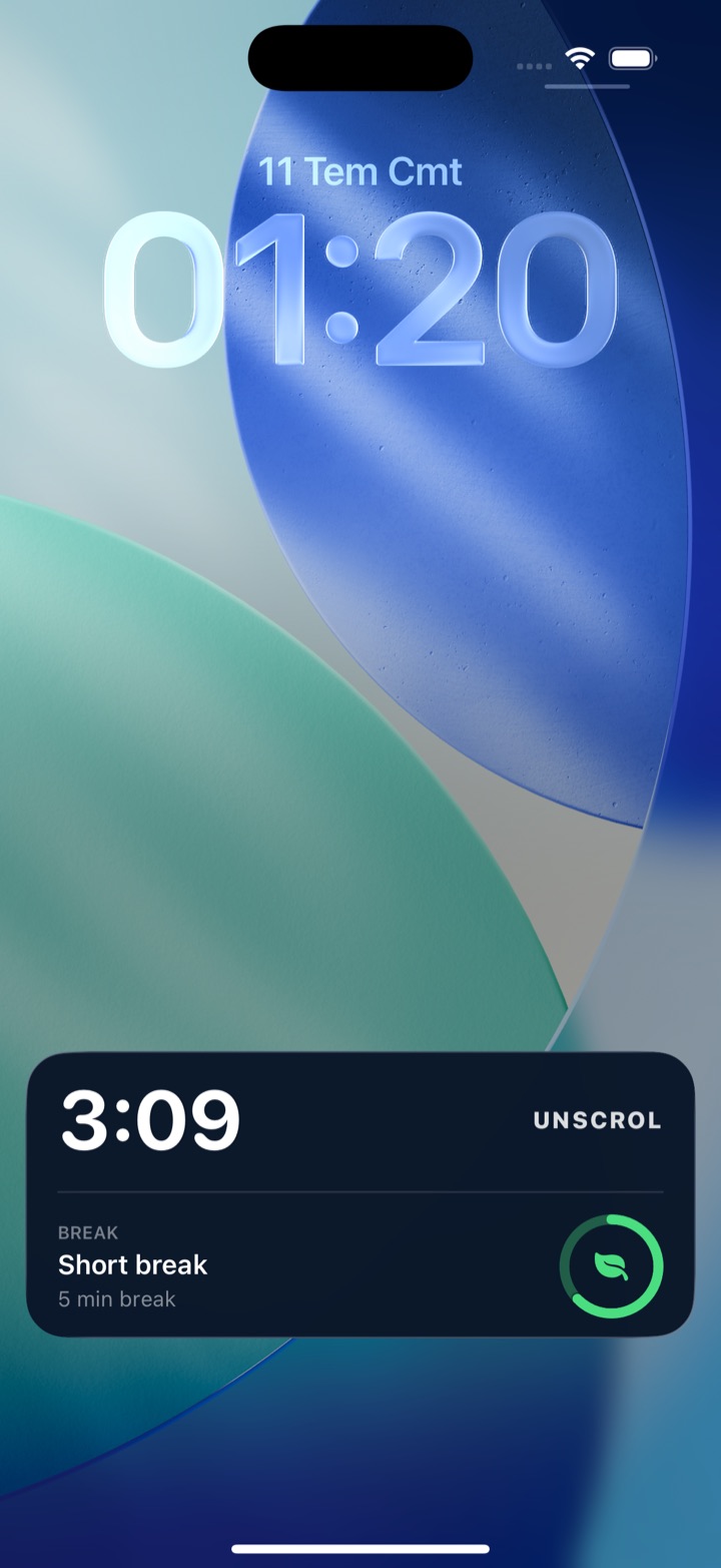
Two honest expectations. The numbers are estimates from crossed thresholds rather than exact minutes, and iOS measures cumulative usage per interval rather than per sitting, so a widget shows a block of your budget, not a stopwatch reading. And the privacy is architectural rather than a promise: iOS hands the app opaque tokens, never app identities, so Unscrol can never see which apps you picked, their names, their icons or your usage of them. That is also why a widget can show your remaining budget but never a per-app breakdown — the data to build one never reaches the app or its servers. Free to download; the optional premium tier adds Streak Saver and five concurrent challenge slots instead of one.
Frequently asked questions
Does the iPhone have a built-in Screen Time widget?
Yes, for the home screen. Apple ships a Screen Time widget that shows information from your Screen Time summary, and the larger the size you pick, the more it displays. Add it by pressing and holding an empty spot on the home screen, tapping the plus button, and choosing Screen Time. What Apple does not document is a lock screen version, and the widget reports usage rather than a remaining allowance. Third-party apps built on the Screen Time and Family Controls frameworks can publish both lock screen widgets and ones that count down a budget instead of counting up usage.
Why do my iPhone widgets not update?
Widgets are not live views. Under WidgetKit, an app hands iOS a timeline of pre-rendered entries and the system decides when to ask for more, within a daily refresh budget it allocates based on how often you actually look at the widget. Apple's guidance has described that budget as roughly forty to seventy refreshes a day, which works out to an update every fifteen to sixty minutes. Low Power Mode reduces or suspends refreshes entirely. Opening the app forces an immediate reload, which is why the number often jumps the moment you launch it.
How do I add a widget to my iPhone lock screen?
Unlock the iPhone, then press and hold anywhere on the lock screen until the wallpaper gallery appears and tap Customize. Choose Lock Screen, then tap the rectangular widget area directly under the clock, or the smaller inline slot above it where the date sits. Pick an app from the list and tap the widget you want. You can fit up to four small widgets, or two small plus one wide, under the clock. Tap Done, then Done again. Lock screen widgets require iOS 16 or later.
What is StandBy mode on the iPhone, and does it help with screen time?
StandBy arrived in iOS 17 and turns a charging, locked iPhone into a small always-on display when you set it on its side in landscape. It helps mainly by removing a reason to pick the phone up, since the clock, a weather panel, or a widget is already readable from across the desk. It can backfire, because by default StandBy shows incoming notifications full-screen and in colour. Turn that off in Settings, then StandBy, then Show Notifications, and enable Night Mode so the display dims to red after dark.